



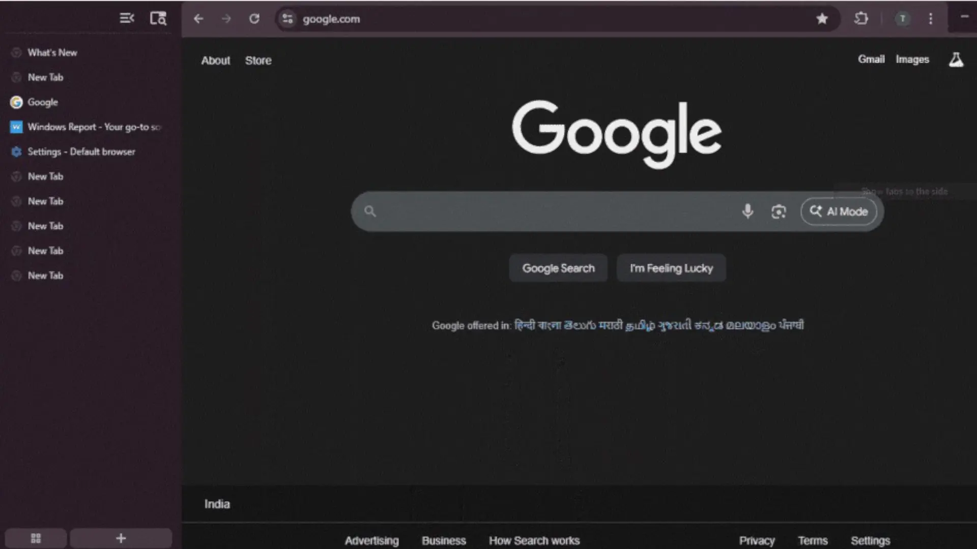

Google has decided to get going with one of the functions most requested by users of its browser: the vertical tabs in Chrome for desktop. The novelty is already being tested in the experimental version of Chrome Canary for desktop. Although it has not yet reached the stable channel, it already allows you to get a good idea of how the organization of multiple open tabs will change.
Until now, if you wanted something similar, you had to resort to extensions or directly switch to browsers like Microsoft Edge, Vivaldi, Brave or Firefoxwho have been offering this type of view for some time. It is a fact: Chrome has joined this functionality quite late. Now Google seems to have heard the complaints: tabs can be moved to a side panel, with more information visible and less chaos at the top of the window.
How vertical tabs work in Chrome Canary
The function is currently available only in Desktop Chrome Canary. You don't have to touch any hidden flags or activate strange options. Once the latest version of Canary is installed, simply right-click on the horizontal tab bar and choose the new “Show tabs on the side” option. As soon as you do this, all the tabs move to a vertical column on the left side.
In that side panel, each tab displays its full title and icon, making it much easier to work with multiple web pages. At the top there is a button tab search and control for collapse or expand the barideal if you want to save some space on the page. At the bottom are kept the tab groups and the classic “+” button to open new tabs without complications.
If you try vertical tabs and they don't convince you, returning to the usual design is just as simple. You just have to right-click on the side panel and choose the “Show tabs at the top” option. Everything returns to the classic horizontal layout without restarting the browser or losing what you had open, so it's easy to test which view best suits your daily life.
What does the vertical view provide compared to the usual tabs?
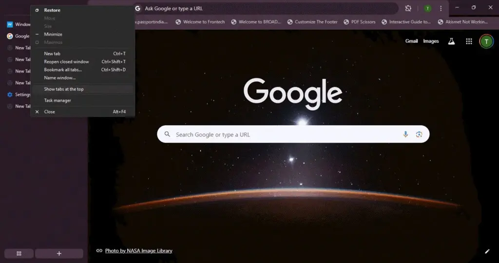
The main reason for using vertical tabs is to take advantage of space. On a widescreen monitor there is too much width and too little height, and the horizontal tab bar ends up filling up with illegible thumbnails when we have many pages open. With the vertical vieweach tab can occupy more height, showing the full name and avoiding the game of guessing what each icon is.
Productivity also wins points: locating a specific tab is faster when you can read full titles and rely on the integrated tab search. The groups continue to function, so those who organize the work in collections (e.g. work, studies, leisure) They can continue to do so, but with a more comfortable and less overwhelming display when the number of tabs increases.
Another interesting detail is that the side panel can be hide and show on the flyso you are not forced to give up horizontal space forever. If you only need to see the entire list at specific times, you can expand the panel, switch tabs, and collapse it again, which is useful for those who always have numerous tabs open.
When will this feature come to Chrome stable?
For now, the Chrome vertical tabs They are in an early testing phase in Canary, so the interface and behavior may still change. The good news is that this is an implementation integrated into the browser itself, not an isolated experiment in the side panel, so it seems like a serious bet on Google's part.
Typically, these features will take several weeks, or even a month, to reach Chrome's stable channel, as long as no major performance issues or compatibility issues appear. If all goes well, it's reasonable to expect that the vertical tabs will end up reaching Windows, macOS and Linux without the need to install extensions, although, for now, there is no clear information about its availability on mobile devices.
Are Chrome vertical tabs worth it?
If you spend the day jumping through piles of tabs, this new feature may make more of a difference than it seems on paper. The combination of Readable titles, integrated search and foldable panel It fits very well with intensive uses, especially on large screens or configurations with multiple monitors.
In the end, it will be a matter of taste: there are users who will continue to prefer the classic bar at the top, but others have been requesting this feature for years and, finally, Google has responded. Such an interesting novelty has not been seen since arrival of Gemini to Chrome. It's likely to generate some controversy, but it could become a key feature for many users. Which one are you: traditional horizontal tabs or are you going to try the new vertical tabs as soon as they arrive in your version of Chrome?


