


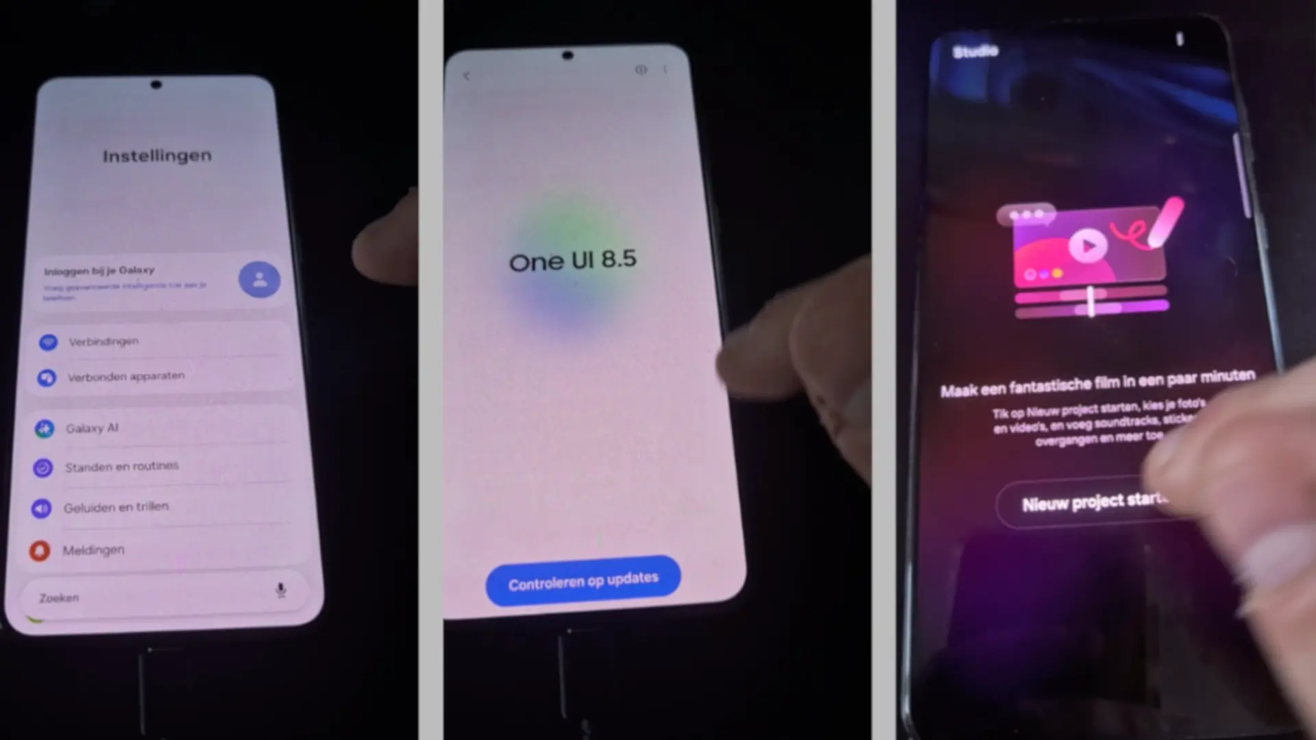

Samsung's next great update is already beginning to be seen. One UI 8.5 It has leaked in images and provides subtle visual changes, but with direct impact on usability. The most prominent novelty is the search bar located at the bottom of settings, a decision designed to improve ergonomics and facilitate use with one hand.
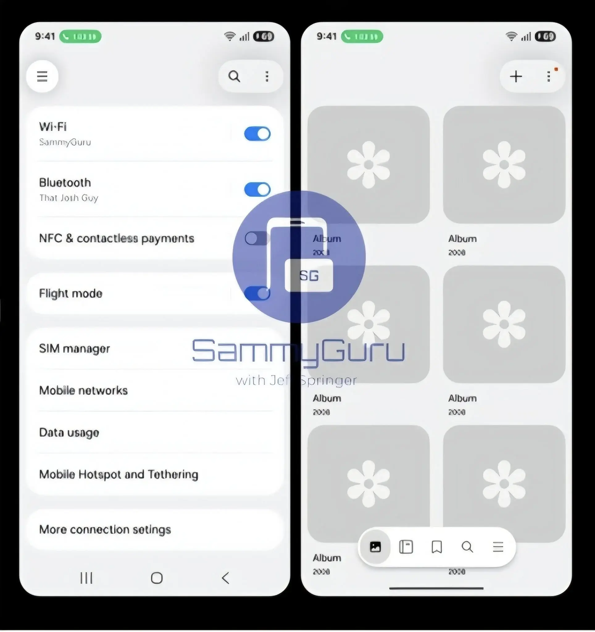
Captures also show a “floating” setback button when accessing a submenu, as well as new depth effects, through soft and degraded shadows on containers. It is not a radical redesign, but an evolution focused on a cleaner, modern and consistent interface with the rest of the system.
Design changes in the adjustment app
The filtration images show several design settings that should be highlighted. To begin with, the Main Settings Screen It presents more compact elements: Secondary descriptions are eliminated and each category occupies less height, which allows you to visualize more view options. The highest information density, together with the lower search bar, allows you to find options with less effort and displacements.
Another important change is in the Search results pagewhich now organizes the shortcuts for categories in a grid of three columns. This shows more useful results in less space, with clear icons and well -organized direct accesses. In the visual, Samsung introduces Shadows in the containers and a Degraded fading at the upper and lower edges that provides sensation of layers and hierarchy.
When accessing a submenu, the aforementioned appears Shadowant floating button with shadow. It is a micro -interction detail that improves the user's orientation and maintains the gesture of always turning to reach, even if we are moving through a long list. In addition, the submenu containers themselves are “raised” slightly through shadows and the same fading effect, reinforcing the sensation of visual hierarchy in the interface.
What do these changes contribute to the user
- Ergonomics: The placement of the search at the bottom reduces the need to stretch the thumb and accelerate access to options.
- Readability: By eliminating subtitles and adding shadows, each block has more visual space and differs more clearly.
- Efficiency: The grid of three columns In the search, it allows you to locate adjustments and shortcuts with less touches.
- Consistency: This visual language is designed to extend to Samsung's own appshomogenizing the experience.
What can we expect and when would one UI 8.5 arrive?
 One UI 8 has already begun to be implemented in this year's flagship models, and everything indicates that One UI 8.5 It will be the version that Accompany the Galaxy S26 family at the beginning of 2026. The filtration comes from an early compilation that has been shown in a previous generation device, so The details could change Before stable launch.
Beyond visual touch -ups, there are indications of New actions in routines that are better integrated with the Google assistant and with Samsung's tools, something that points to a more powerful automation and a more natural coexistence between services.
The update represents a step towards a cleaner interface
It is not a revolution, but a clear turn towards a more accessible and current interfacewith elements designed for daily and practical use. If Samsung extends these changes to their apps, One UI 8.5 could offer a more consistent, agile and comfortable experience from the first use.
What do you think of these changes in adjustments? Do you find the search at the bottom and the floating setback button useful, or do you prefer the previous design?